

If you’re still deciding whether to choose a muted or bold colour for your bedroom walls, take a look at our definitive guide to bedroom colour.
Good bedfellows
Comfy mattress. Check. Down duvet. Check. Egyptian cotton indulgence. Check. South African-born interior designer Kelly Hoppen believes that the bedroom is all about your comfort and your calm. “When you walk into the bedroom, it should draw you in and feel comforting and warm,” notes the London-based design doyenne.
Creating a sense of harmony
Cocooning, mindfulness and individualisation. These are some of the drivers compelling us to transform our homes into personal sanctuaries. Bedrooms, in particular, are sensory-based havens. “It is your sanctuary to create, and the emphasis on everything within this particular space really must be on luxury,” says Hoppen.
There’s no better way to add a touch of glamour, comfort, whimsy or indulgence than by dressing your walls in a soft, soothing hue. Or something more dramatic, if you dare. As long as the colour reflects your personal style.
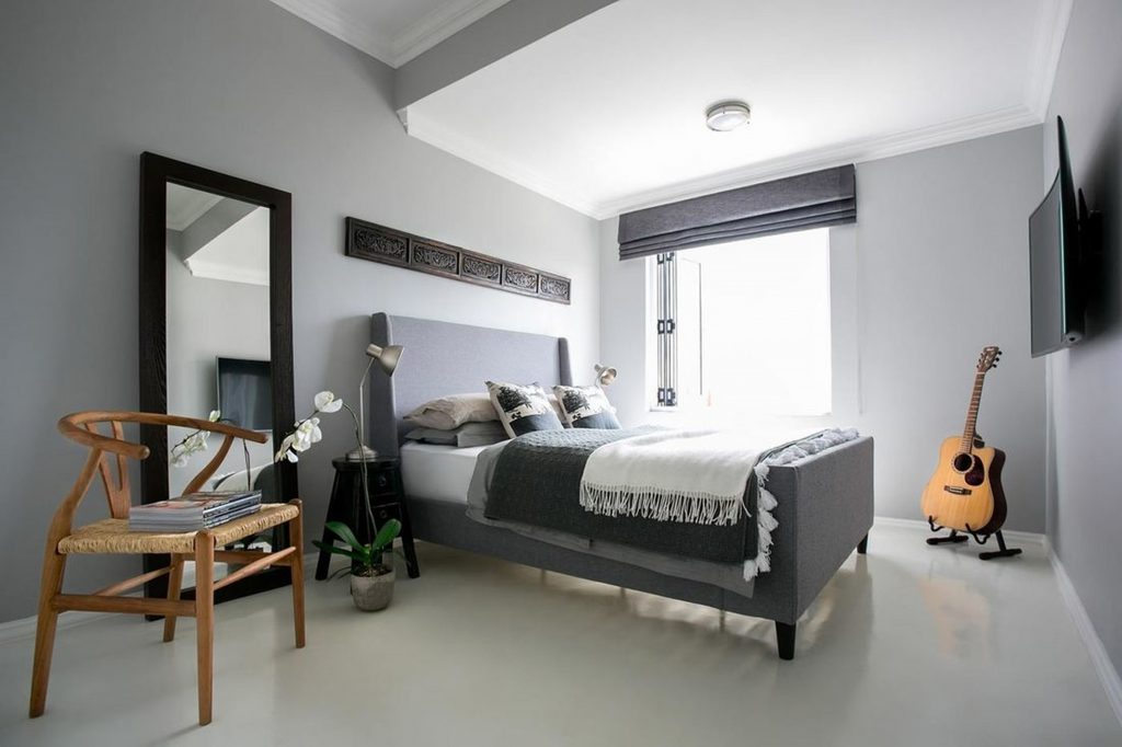
Grey still matters
The versatility of greys offers endless pairing options, including in the bedroom. As this versatile shade is neither bright nor dull, it lends itself to a range of possibilities.
Most trends come and go. “However, in recent years, greys have become the preferred base for most interior spaces,” says Nadine Prinsloo, head of marketing at Cemcrete.
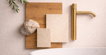
Finishes used for Xavier Saer’s Home: CreteCote White; Colour Hardener Grey; CemPlaster Pavilion Grey; Cemcrete Application: Cherubinos; Styled by Fabiana Hoy; Photographs: Xavier Saer
Greige is having its moment
Plascon has also identified a fusion of grey and beige as its neutral of the year 2019. Part of its Luxury colour story, Ravine (62) is the ideal complement to classically decorated bedrooms. “In contrast to other cooler shades that have been popular in the past, this neutral shade of grey adds warmth to a space,” says Plascon colour expert Claire Bond.
Unsurprisingly, Ravine (62) moves away from the “more is more” concept. This adaptable shade is about creating a space where life’s simple pleasures take centre stage. According to Bond, “Ravine continues to be our warm go-to natural as it provides a neutral canvas making it a safe option when detail needs to be added, be it a coloured painted feature wall, curtaining, flooring or upholstery.”
Colour on cue: Bond recommends introducing woods and shiny copper fittings for a modern touch or textural elements like a rich floor rug for a touch of luxury.
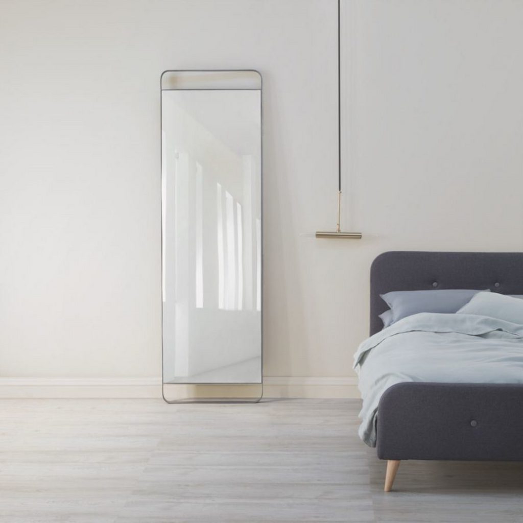
Infinity mirror, hanging T-lamp, both Weylandts, bedlinen, Mungo; Edith bed, @Home
Crème de a crème
Kick back and relax with Creme Brulee, Dulux’s neutral of the year for 2019 – a warm cashmere shade that’s the perfect bedfellow for your abode.
The new shade of the moment invokes a sense of modern, understated charm. It’s calm and cocooning, like your favourite snuggle blanket. “Creme Brulee is inspired by the varied tones and remarkable properties of honey – natural, timeless and enduring, protective, rejuvenating and healing,” says Dulux COlour Consultant, Palesa Ramaisa.
Colour on cue: This warm natural tone blends perfectly with pale shades, wooden accents and even graphic elements. Or indulge your creative side by spicing things up with earthy reds and dark blues for depth and contrast.
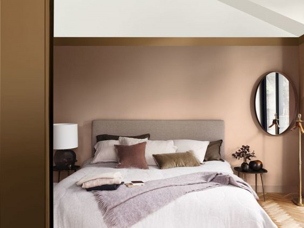
Dulux
Candy cool
But neutrals aren’t the only option. Plascon’s 2019 Glamour Story, with Candy Tuft (P3-B2-1) as the star attraction, has a summery undertone. Its restrained core neutrals and neo-pastels will add a fresh, breezy touch to your abode. Perfectly suited to the confident and creative soul.
TIP: Before choosing a wall colour, measure the amount of natural light your room receives and the direction the light comes from.
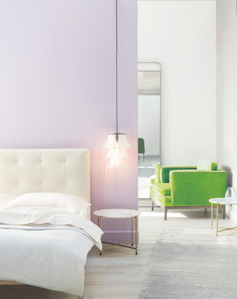
Bedlinen, The Hall Collection, headboard and Obsession chair, Leon at CCXIX; Hanoi tables and Galaxy rug, HAUS by Hertex, Magret lights, Scotch & Sofa; Infinity mirror, Weylandts
Breaking the mould
A contrasting colour makes a contemporary style statement. So add an element of fun to your bedroom by painting door frames, skirting boards and mouldings in a popping colour like Beeswax Candle (Y1-B1-1).
This funky and cheerful shade is sure to brighten up your space. Use this approach in abundance to create a boho style. Or simply incorporate it sparingly to a neutral scheme to liven up contemporary or minimalist interiors.
Colour on cue: Try this technique on windows too, to frame your view. Or raise the roof by painting your ceiling in a staurated Bondi blue-inspired shade.
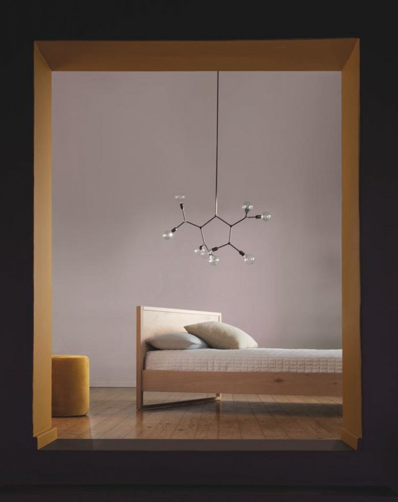
Spati bed, Weylandts; No.8 footrest, sofacompany.com; Molecule 8 Light, Hoi P’loy.
Into the blue
Bedrooms fused with moody splashes of blue-green hues like turquoise, teal and aquamarine are extremely calming and invoke a sense of crashing waves and beachside living. Ideal for urbanites seeing refuge from the daily grind.
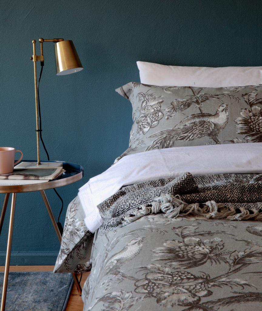
Benguela bed linen, HAUS by Hertex
Sage advice
For a twist in the colour tale, dress your walls in a soft shade of sage green. This sophisticated woodland colour has a neutral undertone, so expect a sense of understated elegance. Those who shy away from anything pink and pretty will find solace in this cool botanical-inspired shade.
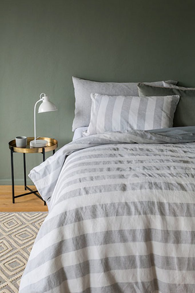
Hinterland bedding, HAUS by Hertex


Leave a Comment