

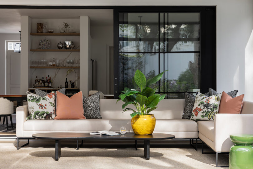

You have the beautiful sofa, the tasteful coffee table and the expensive rug. Your walls are painted in a sophisticated shade of off-white, your furniture is coordinated and everything is neat. Yet somehow, your living room still feels a little flat. Vinette Diab-Nicholls, founder and CEO of Giava Interiors, shares how to bring a neutral space to life through the artful use of colour, pattern and texture.
It’s one of the most common decorating dilemmas: a home that looks perfectly respectable but feels uninspiring. Nothing is necessarily wrong, yet something is undeniably missing. Here’s the good news: You don’t need to repaint your walls emerald green, buy outrageous furniture or abandon your beloved neutral palette to fix it.
What your home probably needs is a little more visual tension: the interplay of colour, pattern, texture, shape and contrast that makes a space feel interesting and alive.
Stop decorating in one shade of beige
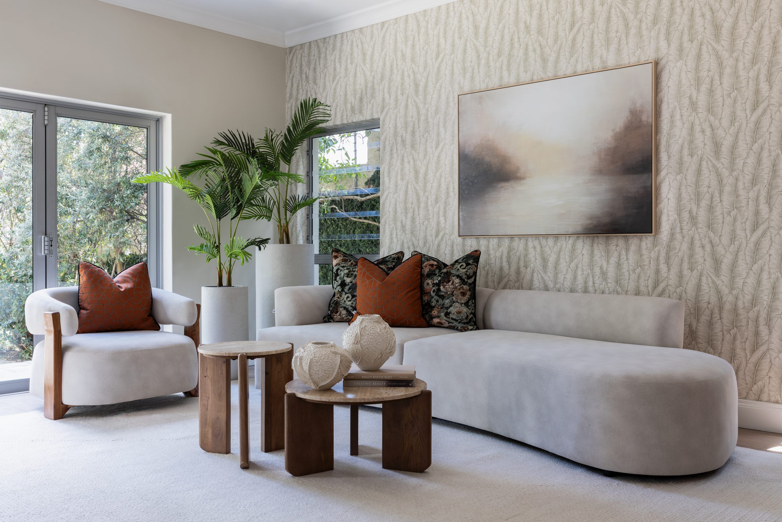
Neutral interiors are timeless for good reason. They’re calming, versatile and elegant, but there’s a difference between a beautifully layered neutral interior and just a sea of beige. The solution isn’t necessarily to introduce bright colour. It’s to create variation within your existing palette. Combine warm ivory with oatmeal, mushroom, caramel, taupe and chocolate brown. Introduce darker accents through furniture, lighting or decorative objects. Allow lighter and deeper tones to play against one another.
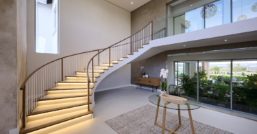
In this Rosebank residence, for example, the restrained palette is enriched by warm autumnal tones, natural materials and sculptural furniture, creating a serene interior that nevertheless has depth. A neutral room needs tonal contrast just as much as a colourful one does.
Texture is your secret weapon
If colour is what catches your eye, texture is what makes a room feel inviting. It’s also arguably the most important ingredient in a successful neutral interior. Think of the difference between a room filled with smooth, shiny surfaces and one that combines linen, plush velvet, woven fibres, richly grained timber, natural stone and tactile upholstery. Even when these materials share a similar colour palette, they interact with light differently, creating subtle variations that make the space feel luxurious and interesting.
Start with your largest pieces. A beautifully textured sofa, a substantial woven rug or curtains with a generous linen-like drape can transform the atmosphere of a room. Then introduce contrasting finishes: a smooth ceramic vase against a rustic timber table, a velvet cushion on a linen sofa, or a sleek metal lamp beside an upholstered armchair. The trick is to combine textures that contrast without competing.
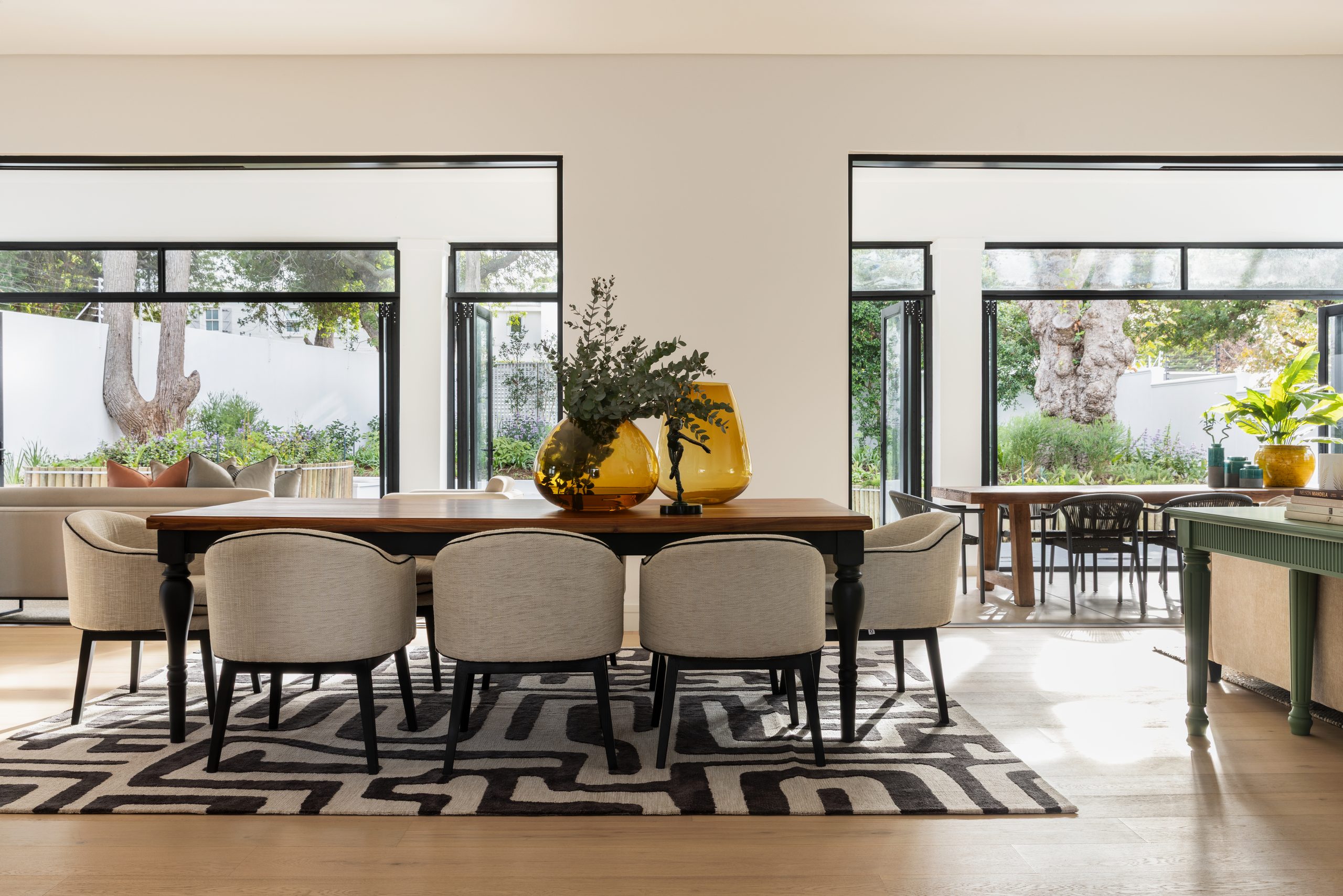
In Giava Interiors’ Constantia project, the timber dining table, upholstered chairs and patterned rug bring warmth to the open-plan space. The glossy amber glass vessels contrast with the softer upholstery and rug, showing how different surfaces can add depth even within a restrained palette.
Learn to mix patterns without creating chaos
Pattern is one of the quickest ways to inject personality into an interior, yet it’s also one of the elements home owners fear most. Will the stripes clash with the florals? Is a patterned rug too much with printed cushions? What if everything looks terribly busy? The secret is understanding scale. A successful pattern combination usually includes designs of different sizes. For example, pair a large botanical print with a medium-scale geometric pattern and a subtle stripe or small-scale motif. Give the patterns something in common. Use a shared colour or complementary palette, and allow plain fabrics to provide breathing space.
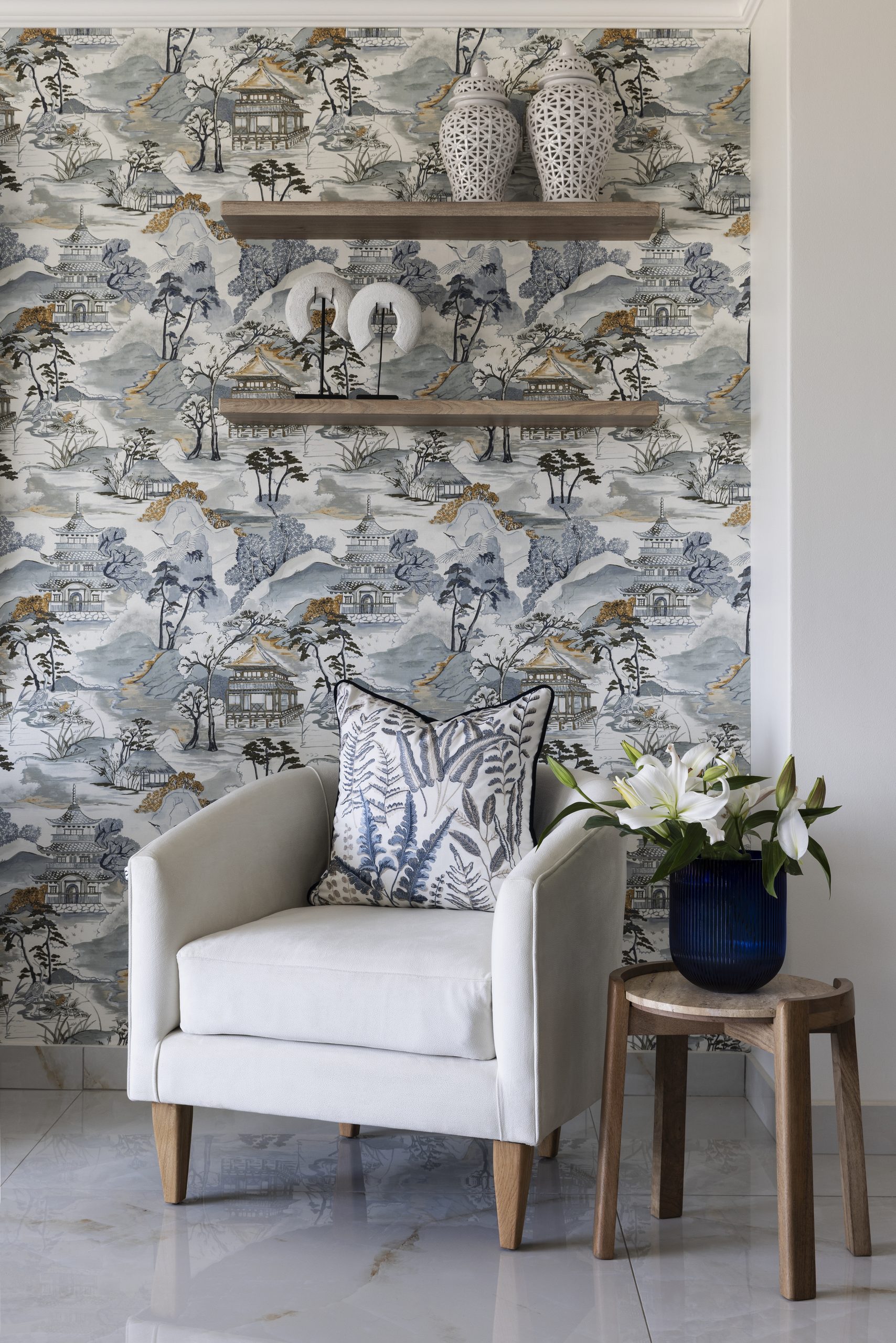
If you’re nervous, start small. Introduce patterned scatter cushions, an upholstered occasional chair or a decorative lampshade before committing to an entire wallpapered room. In Giava’s Lacomo project, detailed scenic wallpaper is paired with a bold botanical cushion. Shared blue, grey and white tones connect the different patterns, while the plain upholstered chair and simple timber shelves provide breathing space. The patterns work together without needing to match. Remember, pattern doesn’t have to shout to make an impression. Sometimes a subtle weave, fine stripe or understated geometric design is enough.
Every room needs a little contrast
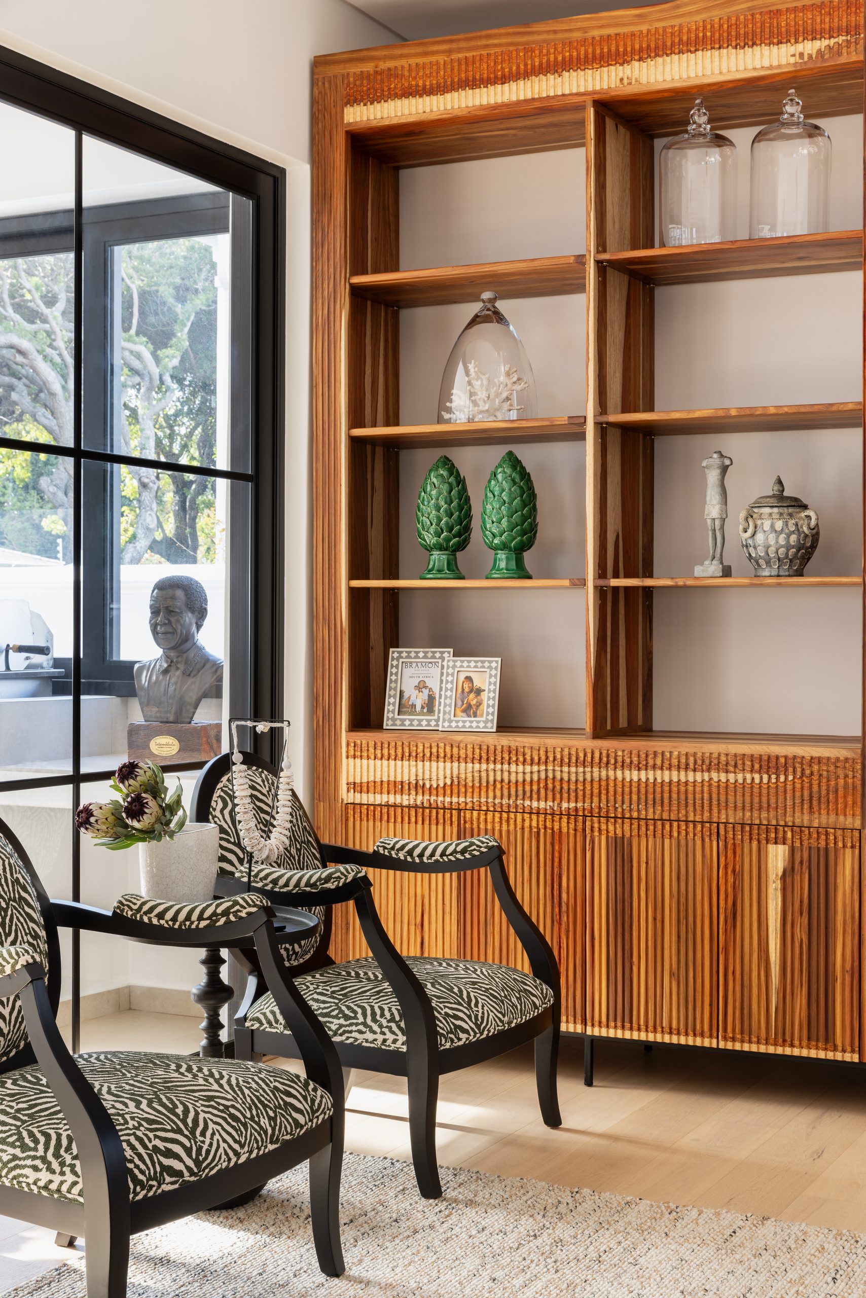
One of the biggest reasons a room feels boring is that everything is too perfectly matched. The furniture belongs to the same collection. The timber finishes are identical. Every decorative accessory follows the same colour scheme. The result may be harmonious, but it can also feel predictable. Interesting interiors need contrast, not just between colours, but between styles, materials, shapes and proportions. Pair a contemporary sofa with an antique-inspired side table. Place a sculptural modern lamp on a traditional wooden console. Introduce black metal or dark bronze into a pale interior.
You can also create contrast through shape. If your room is dominated by rectangular furniture and straight architectural lines, introduce a round coffee table, a curved occasional chair or an organically shaped mirror. Here, warm timber cabinetry contrasts with black chairs and bold, patterned upholstery. The curved chair arms soften the cabinetry’s straight lines, while clear glass vessels and green ceramic ornaments introduce different textures and finishes. Together, these elements give the room character while keeping the overall look elegant and considered.
Be brave enough to introduce colour
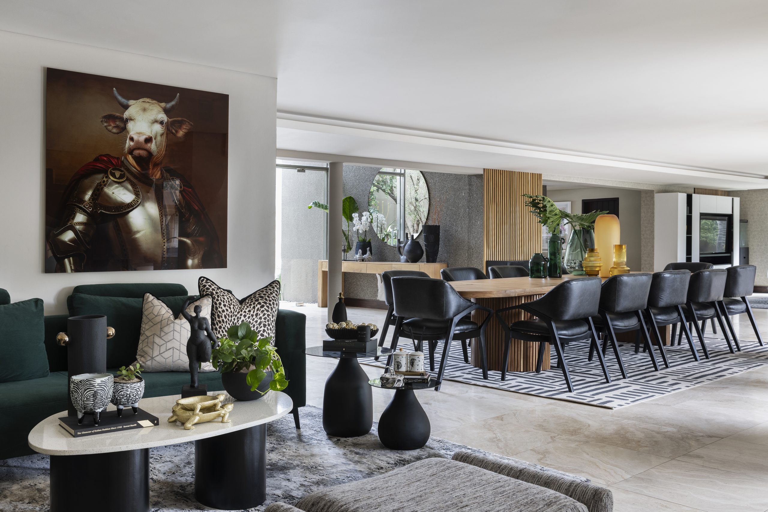
A neutral home doesn’t have to be a colourless home. In fact, even a relatively small amount of carefully chosen colour can make an enormous difference. The secret is to think of colour as an accent rather than an obligation. Start by identifying the undertones in your existing palette. Warm neutrals often pair beautifully with olive green, rust, terracotta, tobacco and ochre. Cooler neutrals can work with dusty blue, slate, charcoal and muted sage. Then repeat your chosen accent in two or three places throughout the room. A patterned cushion might pick up the colour of an artwork, while a decorative vase or upholstered chair reinforces it elsewhere.
Here, a deep green sofa brings richness to an otherwise neutral interior, with the colour echoed in glassware and foliage. Mustard-yellow accessories introduce a warmer accent in the adjoining dining area, while pale walls and flooring keep the overall space feeling light. And don’t overlook darker colours. Deep navy, forest green, burgundy and chocolate brown can be surprisingly effective in otherwise pale interiors, adding depth without overwhelming the palette.
Give your room something worth looking at
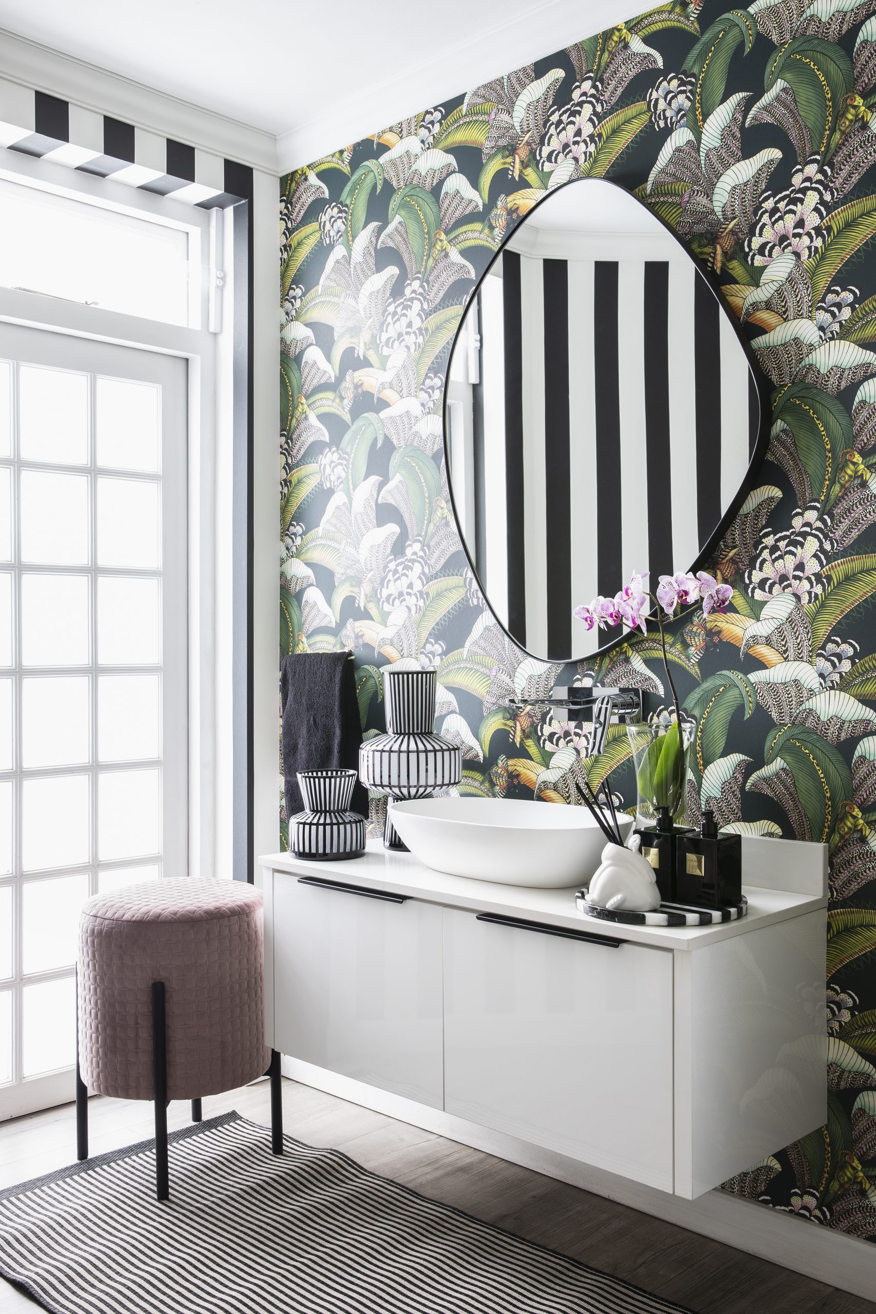
Walk into a memorable room and you’ll usually find that your eye is drawn to something immediately, whether it’s a striking artwork, a beautiful statement light, an unusual occasional chair or an exceptionally crafted coffee table. This is known as a focal point, and it’s an essential ingredient in successful interior design. Choose a feature that deserves attention, then allow the surrounding elements to complement it without competing for the spotlight.
In this bathroom, bold botanical wallpaper and an organically shaped mirror turn the vanity wall into a focal point. The simple white cabinetry and basin give the eye somewhere to rest, allowing the expressive pattern and sculptural shape to take centre stage.
Make it personal, not just pretty
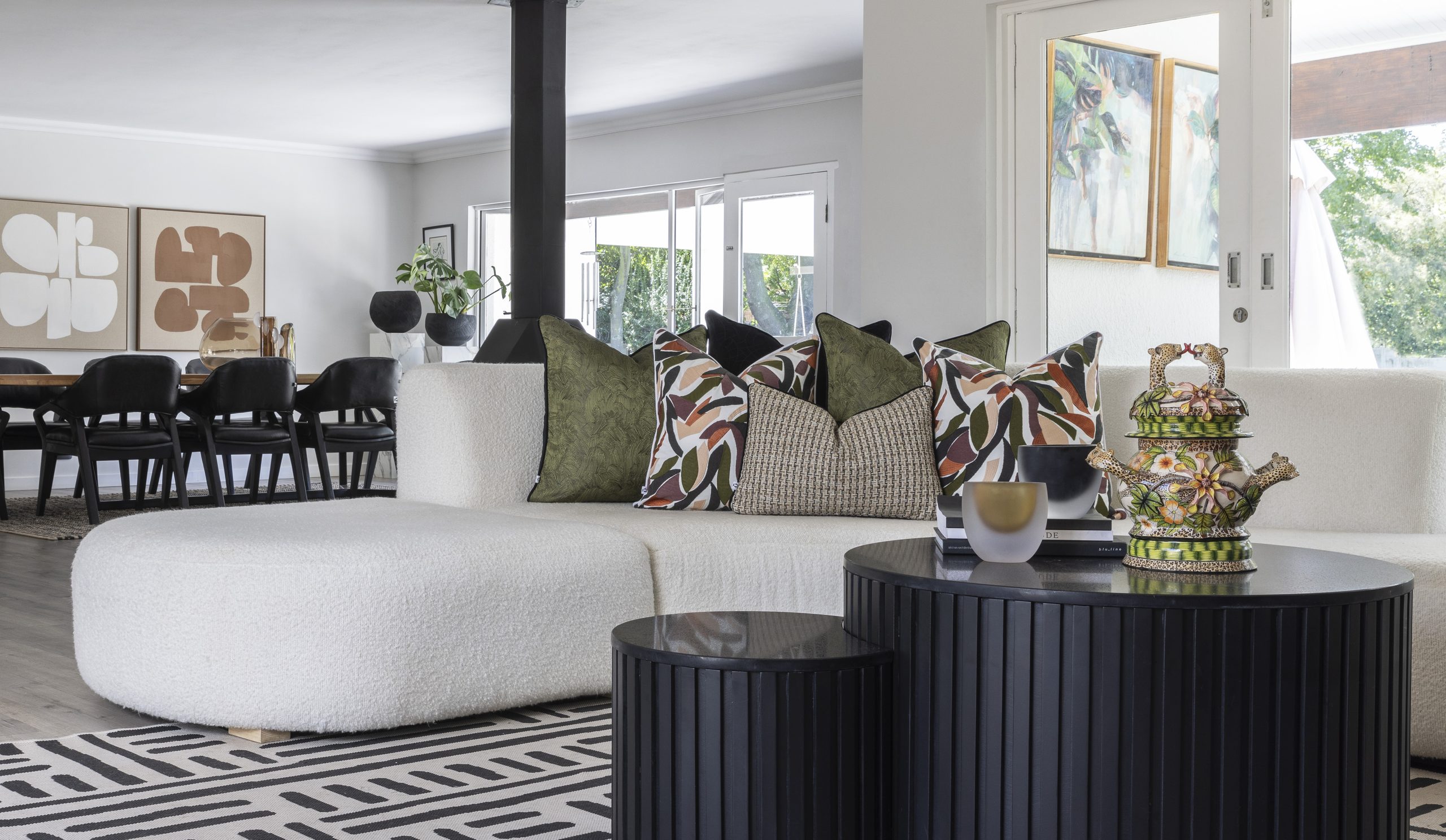
Perhaps the most important distinction is personality. A room assembled entirely from matching furniture and coordinated accessories can look polished, but it may still feel soulless. The most compelling interiors tell stories, reflecting the people who live in them through artwork discovered on holiday, a treasured antique inherited from a grandmother, or a collection of beautiful books, ceramics and objects that reveal personal interests. Mixing old and new, handmade and contemporary, precious and practical helps create a space that feels individual rather than straight out of a showroom.
Here, an ornate ceramic piece brings a playful, individual touch to a room with contemporary furniture. Its colours echo those in the scatter cushions, showing how an unusual decorative object can sit comfortably within a cohesive scheme while giving the space its own character. Don’t worry if everything isn’t perfectly matched. Those little differences are often precisely what give a home its charm. The key is to introduce layers that make the space come alive.

Leave a Comment