
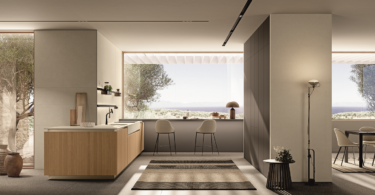
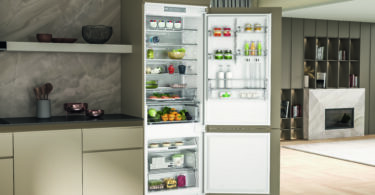
As far as kitchen design is concerned, not only will the right cabinetry help you create a clutter-free, efficient kitchen environment, but it’s also one of the first elements you’ll notice when walking into the space. With so much pressure to choose right the first time, our experts reveal the no-fail cabinetry rules to keep in mind.
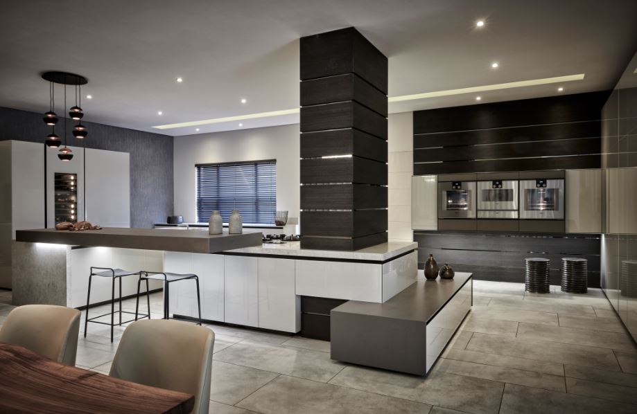
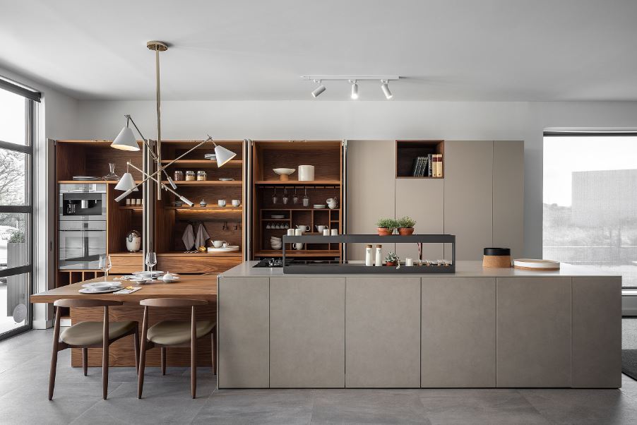
“Less is more is always a concept we have worked with but not at the sacrifice of authentic emotion and genuine interest through the use of natural and luxurious materials. We have always focused on neutral colours and this can range from the off-whites to calming sand tones to your richer and deeper charcoals. We find that we can always achieve the desired aesthetic and use texture then to bring the needed interest and drama to the space. The reason clean-lined cabinets are not just a trend but a foundational look is that we need simplicity now more than ever, but with this spaces that are grounded in interest and emotion. We are not looking for plain spaces that err on the side of being clinical, but rather spaces that remind us and bring us back to our humanity, spaces that are inspired by nature itself.” – Philip Richards, blu_line
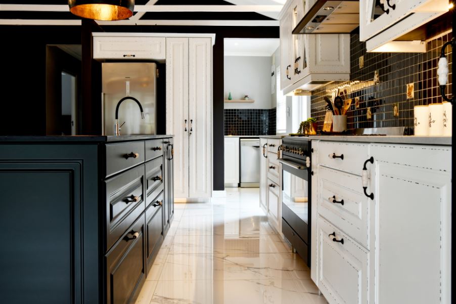
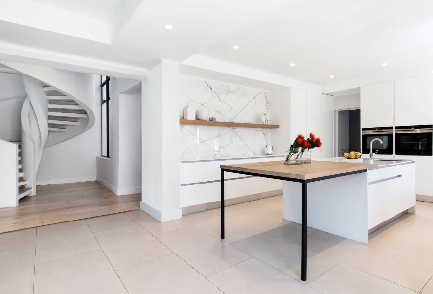
“The cliché of your kitchen being the heart of the home has stood the test of time, as has the selection of neutral, easy-to-accessorise tones with accents of wood to create a warmer, more homely atmosphere. Our primary advice would be, when selecting the tones to be used in your kitchen environment, white, grey tones and woods are always a winner. The timeless classics of white and natural wood finishes still tend to be firm favourites – that said, certain textures and finishes will put a timestamp to the colour, but matt/satin white remains timeless in its appeal.” – Sanette Jansen Van Vuuren, Easylife Kitchens Table View
“Simple, uncomplicated design will remain tasteful. Less is more. Much depends on the other finishes throughout the living areas as well as layout and lighting, both natural and other in the kitchen. However, if you’re looking to create something timeless, we would generally consider more neutral tones as strong colour trends may be short-lived and can also be limiting in the event of resale.” – Melanie Stein, Eurocasa
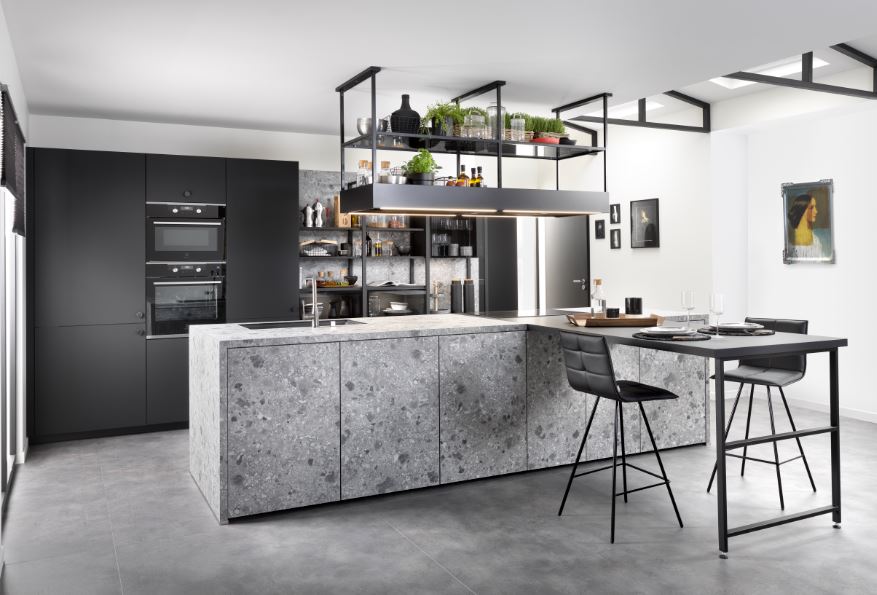
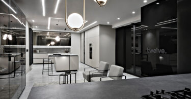
“We will see a continuation of open-plan living that integrates the kitchen as the hub of modern family life, with the inclusion of beautiful textures and finishes to elevate it to a true design statement within the home. The colour of your kitchen cabinetry should flow effortlessly with the design and décor of the rest of the house, if not dictate it. Therefore, choose a colour scheme that flows; don’t be tempted to go for white if the only motivation is to play it safe for longevity. Kitchens with warm grey or bold anthracite hues will always look timeless within a home that speaks the same language.” – Erin Braithwaite, FABRI
“Clean lines and good underlying geometry are always classic. We love to add something old and always something natural or raw in our kitchen design. Black and white are timeless colour choices, and we love the idea of a recessed handle to create a truly classic look.” – Heidi Arenstein, Future Classics
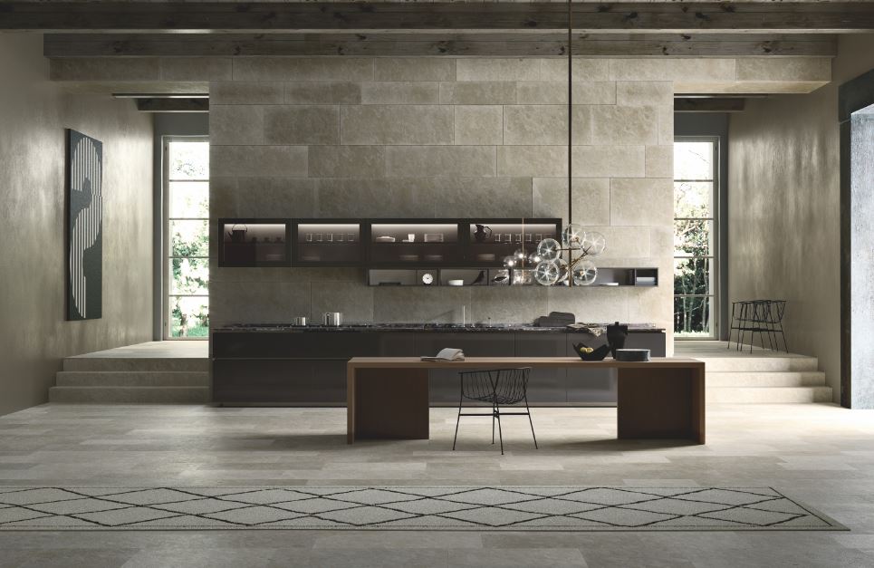
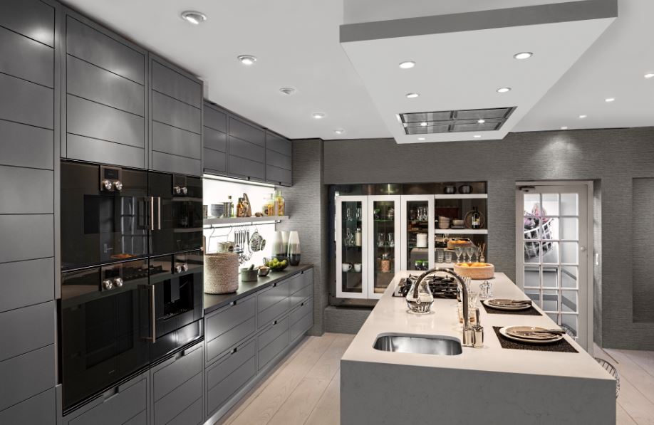
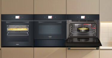
“Easy-access pull-out drawer units, for clear and easy access to goods and stock. Clean lines, less visible appliances and more ‘appliance garages’ as well as display or open cabinetry units will remain timeless. Plain colours (like white, grey etc.) mixed in with natural wood and more bold colours such as charcoal, moody blue, or even a rich yellow are good options to consider. That said, plain colours tend to be more timeless than wood finishes.” – Laurent Riviere, Schmidt
“Invest early on in giving yourself everything you can with regards to space planning and storage solutions. A successful layout will benefit you for years to come whereas something wrong will irritate you immediately. We always suggest a customer select something neutral. Whether it is warm or cool, a neutral palette is less likely to date and can be integrated into a new colour scheme with ease.” – Daniel Slavin, Slavin
To find out more, pick up the June 2020 issue of SA Home Owner magazine, on sale now!

Leave a Comment