


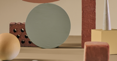
Blue vs Green. The battle of colours…
Indecision has never looked so beautiful – When it comes to key colours for 2013, no other two hues are as ready to reinvent themselves as blue and green. Like the music and lyrics of a song, or the depths of the ocean, blue and green rather go hand in hand together.
Where the one is cool and tranquil the other exerts energy and force.
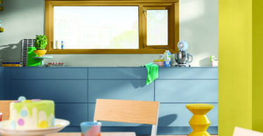
Sapphire and indigo blues with a purple tinge has authenticity and glamour. Free spirited in interiors, these blues work best in spaces with good natural light. Used in harmony tranquil blues with a pop of bright green creates the perfect balance in most living spaces. A deep shade can also be combined with most other colours, think ‘denim”.
Either combine different shades of blue, such as the ombre wall below in “Sapphire springs 3” and “Holiday blues 2”, or pick one and let it stand alone, such as Dulux colour of the year “90BB09/186”.
Bright greens of the moment are reminiscent of emerald, minerals and molecules, which lends a real other worldly magnificence, especially when paired with yellow toned greens or deep indigos and violets.
Try Dulux’s “Emerald Delight 3” to energise your space, but be wary, a little will go a long way. If you intend for this colour to take centre stage, then keep your space simple and add plenty of balancing whites and neutrals, such as Dulux “Grey steel 3”.
In love with both? Find the perfect in-between teal, such as Dulux’s “Sea urchin 2” and add your royal blues and brilliant green to your heart’s content.
For more inspiration visit Colour Futures and see how Dulux has paired these two wonderful colours and everything else in between.
With thanks to Dulux SA.


Leave a Comment