


By Alma Viviers and Anne Duncan, Photography Micky Hoyle
Colour is like a new haircut. It has the power to affect how you look and feel. For better or for worse. Which is why colour therapy is all about using colour to create well-balanced spaces and happier homes. Here’s how to colour-ise yours…
Be colour wise
Don’t ignore your gut feel. You may not respond to a colour the way colour psychology says you should. It’s not a precise science and your own colour history, cultural background and associations will play a role in your response to a particular shade. Always test various colours in a space and then go with what you feel. Think of the space. When you consider a colour scheme for a room, bear its function in mind. Is it a space where you need to work or where you want to relax? You may need to adapt your colour choices accordingly. Look at the light. Consider the size of the room and the amount of natural light it gets before choosing a colour.
Light colours reflect more light and will make a small, dark space look bigger and brighter. Conversely, dark shades reflect less light and will help make a large, empty space look smaller and cosier. Maintain a balance. Introduce warm touches to cool schemes and vice versa. And, instead of painting a room all one colour, which can be dull and monotonous, try to introduce colour harmonies.
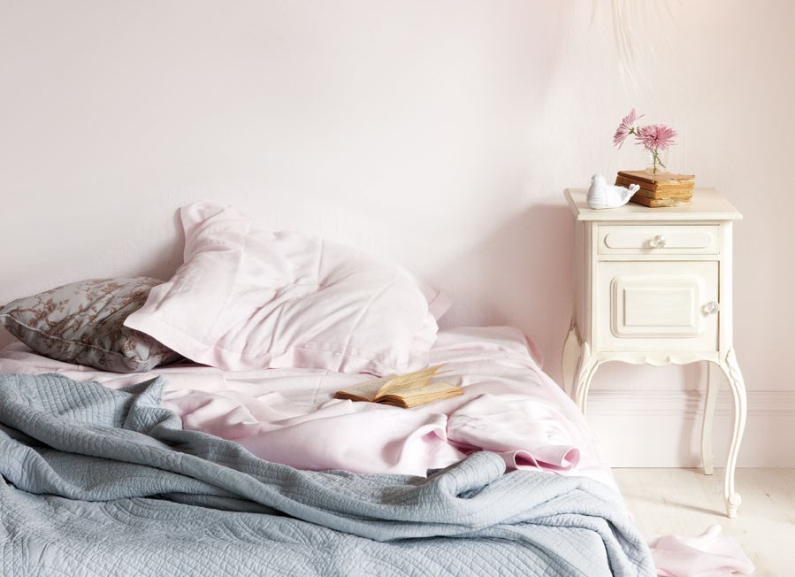
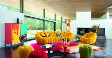
Friendly living space
“The colour you choose for your living area should reflect your personality and set the tone for the mood you want to create,” says Plascon Colour Manager Anne Roselt. “If you want a relaxing space, then blues or greens are perfect. Colours that have a lot of energy, like bright reds, oranges and yellows, are fun and sociable but can become overbearing – perhaps consider using them for a feature wall instead of the entire room.”
- Yellow is a warm and friendly choice, though it’s best to combine it with other colours as too much can create anxiety. A yellow with a green undertone also tends to make people feel sick. “The lighter golden-yellows and butter-creams work best in interiors,” says Anne.
- Orange is a sociable colour and provides a wonderful backdrop for candlelight. It’s perfect to stimulate lively conversation and atmosphere – but limit its use to accents if you want a room that’s relaxing and not too energising.
- Green brings a feeling of calm and space – ideal if you want a cool, tranquil sanctuary. “But beware of dirty greens or yellow greens, which can make you feel nauseous and depressed,” warns Anne.
Hearty kitchen
“There are colours within each colour family that work wonderfully in a kitchen,” says Anne. “It all depends on the mood you want and need. Kitchens are also great spaces for accent colours, says Anne. “For instance on a feature wall, in the space between a counter and wall cupboards, or the inside of cupboard doors – which means you can go for bold brights without overwhelming the room.”
- Red makes us feel physically strong and drives us to action – perfect for a busy kitchen. However, this passionate shade can lead to anger, so it’s best to limit its use to accent walls or accessories.
- Orange stimulates the appetite and digestion, and gets the creative juices flowing. It’s a warm and welcoming choice for the heart of the family home. “This includes all the shades of orange – from bright through to terracotta,” says Anne.
- Yellow activates joy and creates a friendly, feel-good space. However, too much yellow can lead to nervousness and irrational behaviour. Rather bring in bursts of sunshine with a bright yellow accent colour, such as Golden Daffodil (Y3-A1-1).
- Green is the colour of nature and has a balancing effect – ideal if this is the room where you like to unwind after a busy day. A bright green, such as Dragon’s Hide (G2-C1-1) or a lime green, such as Lime Miss (Y6-A1-2), make for an uplifting accent colour.
Studious study
Research has shown that the colour of a work space can significantly influence employees’ emotions and productivity.
- Blue is not only relaxing but also improves comprehension. Studies have shown that workers in blue offices feel the most centred, calm and positive towards their work. Counteract its sedative properties with accents in creative orange.
- Green is another office winner as it helps to reduce anxiety. It can become too tranquil though, so avoid it if you need to keep busy – or balance it with bursts of energising red.
- Turquoise combines blue’s heart-rate reducing benefits with green’s relaxing virtues. It provides a fresh and uplifting atmosphere without causing distraction or over stimulation.
- Orange is energising and motivating. It stimulates creativity and creates a warm, sociable environment. Plus it’s the perfect complement to calm, centred blue.
Calm bathroom
“Here I’d recommend relaxing colours,” says Anne. Certainly, spa-like shades look clean and fresh set against the white of most bathroom fittings.
- White is bright and airy and it’s the colour of hygiene and cleanliness. Use it as a backdrop to set o_ other colours, recommends Anne. “On its own, white can make a room look cold and isolating.”
- Blue is peaceful, relaxing and pain relieving. Balance it with warm natural materials, like wood or bamboo, to prevent it from looking too cold.
- Green is harmonious and nurturing and looks fresh and natural against white.
- Pink is uplifting and soothing, plus it flatters the skin – just what you need when you look in the mirror first thing in the morning.
Happy nursery
“Light pastel shades are best,” advises Anne. “Only use bright colours for toys or accessories. Bright colours are interesting to babies but can easily be overwhelming.”
- Pink is perfect – and not just for baby girls. It has a nurturing and pacifying effect, and creates a feeling of security.
- Gentle baby blue creates a relaxing and peaceful atmosphere, and helps baby to feel protected.
- Soft green is nurturing and healing and is the perfect choice for a soothing space that is not gender specific.
- Pale yellow is a warm, happy shade and will make for a sunny, neutral room.
As seen in Plascon Spaces 10


Leave a Comment