

When you’re in the process of selecting the ideal paint for your home, there are numerous key factors to keep in mind. Your choice of colour plays a pivotal role in establishing the atmosphere and personality of each room. Additionally, it’s crucial to evaluate the room’s purpose, lighting effects, and the existing interior decor to make well-informed choices. To delve deeper into these considerations, we’ve enlisted insights from two paint experts.
What are the trendy paint colours that are currently being used inside of the home?
“Colour trends can vary significantly based on personal preferences, lifestyle, home decor, and interior design styles. Regardless of what colour experts predict or recommend, your choices should align with your personal preferences, the specific room’s lighting, its intended purpose, and the desired ambiance you wish to create. It’s always a good idea to test paint samples in your space before making a final decision. If you find yourself uncertain about your choices, consider enlisting the assistance of a professional interior designer. Nevertheless, there are some definitive colours currently trending – palettes featuring rich, nature-inspired, healing hues, all aimed at transforming a house into a true haven.
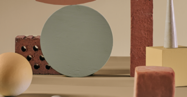
“Soft and muted pastel shades, such as blush pink, pale pine, minty greens, and serene sky blue, have made a remarkable comeback. These watery tones, combined with warm neutrals, bring about gentle, peaceful colours that instil a sense of serenity and lightness in a space. They evoke a lightly romantic, dreamy, and optimistic atmosphere – what’s not to love about pastels?
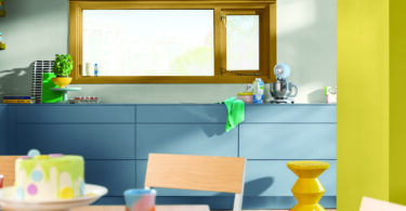
“While neutrals continue to dominate main walls, there’s a growing trend of incorporating bold and vibrant colours as accent walls or in smaller areas like doors, cabinets, or furniture. These pops of colour can infuse personality and visual interest into the overall design.” – Herman Rabe, technical training manager at Prominent Paints
What advice do you have for homeowners who are exploring the latest paint colors for their homes?
“Dulux simplifies the decorating process for homeowners with our color experts, who translate global insights and trends. Every year, as part of our annual Colour Futures forecast, we introduce the Colour of the Year, which captures the current mood. We present practical ways for homeowners to incorporate this colour into their spaces, along with inspiring visuals. Wild Wonder, the 2023 Colour of the Year, sparks creativity and is supported by colour palettes that emphasise nature’s magic. Explore the latest paint colours here. You can also visualise the colours before painting by using the fast and free Dulux Visualizer app, which demonstrates how Wild Wonder can enhance your home. Test your shortlist of colours with Dulux colour testers to see precisely how they will appear on your walls.” – Palesa Ramaisa, colour projects designer SSA, Dulux
Are there any innovative techniques homeowners can employ to integrate these colors into their homes?
“Two shades are better than one, and three is even better. When painting walls, create distinct zones by balancing warm and cool shades. Using two shades works best for establishing complementary zones and adding dimension to your space. Three shades can blend well, offering a subtle burst of creativity without overwhelming the senses, striking the perfect balance and fostering a sense of wellness.” – Palesa Ramaisa, colour projects designer SSA, Dulux
Herman Rabe, technical training manager at Prominent Paints shares guidelines that homeowners should follow when painting rooms:
While there are no strict rules for painting rooms, several general guidelines can help you achieve pleasing and harmonious results. Here are some considerations to keep in mind:
Prepare surfaces properly: Before painting, always ensure that surfaces are prepared by cleaning, repairing imperfections, sanding, and applying a primer if necessary. A solid foundation guarantees a smooth and durable paint finish.
Test paint colours: Before committing to painting an entire room, test paint colours by painting 1m x 1m swatches on the walls. Evaluate them under different lighting conditions to gauge their appearance and compatibility with the room’s lighting.
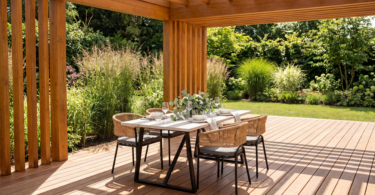
Consider the room’s purpose: Paint colours can influence mood, emotions, activity level, and attentiveness. Consider the room’s function and the atmosphere you wish to create. For example, calm and soothing colours like blues and greens are suitable for bedrooms, while vibrant colours like yellows and oranges can be ideal for spaces like playrooms, home offices, or home gyms.
Coordinate with existing elements: Take into account existing elements in the room, such as furniture, flooring, and fixtures. Choose paint colours that complement or harmonize with these elements. Pay attention to colour undertones to ensure compatibility.
Use the 60-30-10 rule: In interior design, the 60-30-10 rule is a common guideline. It suggests that roughly 60% of the room should feature a dominant colour, 30% a secondary colour, and 10% an accent colour. This approach creates a balanced and visually appealing composition.
Featured image: Dulux


Leave a Comment